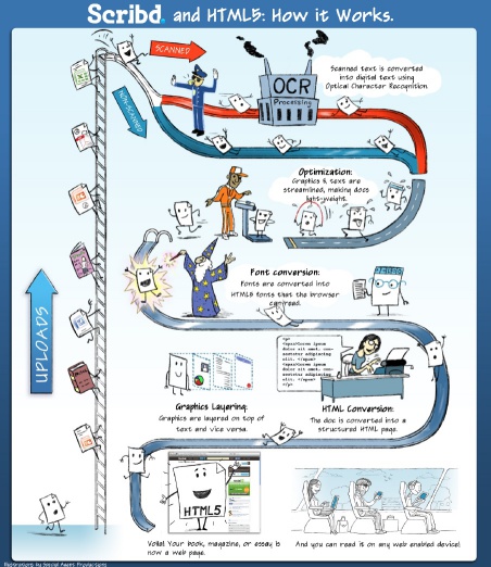
This is the fourth post in our series about Scribd’s HTML5 conversion. The whole process is neatly summarized in the following flowchart:
In our previous post we wrote about how we encode glyph polygons from various document formats into browser fonts. We described how an arbitrary typeface from a document can be sanitized and converted to a so called “@font-face”- a font that browsers can display.
The next challenge the aspiring HTML5 engineer faces is if even after hand-crafting a @font-face (including self-intersecting all the font polygons and throwing together all the required .ttf, .eot and .svg files ), a browser still refuses to render the font. After all, there still are browsers out there that just don’t support custom fonts- most importantly, mobile devices like Google’s Android, or e-book readers like Amazon’s Kindle.
Luckily enough, HTML has for ages had a syntax for specifying font fallbacks in case a @font-face (or, for that matter, a system font) can’t be displayed:
    <style type="text/css">
    .p {
	font-family:
	    myfontface, /* preferred typeface */
	    Arial,      /* fallback 1 */
	    sans-serif; /* fallback 2 */
    }
    </style>
There’s a number of fonts one can always rely on to be available for use as fallback:
(Yes, that’s right- every single browser out there supports Comic Sans MS)
However, it’s not always entirely trivial to replace a given font with a font from this list. In the worst case (i.e., in the case where an array of polygons for a subset of the font’s glyphs is really all we have- not all documents store proper font names, let alone a complete set of glyphs or font attributes), we don’t really know much about the font face at hand: Is it bold? Is it italic? Does it have serifs? Is it maybe script?
Luckily though, those features can be derived from the font polygons with reasonable effort:
Detecting bold face glyph polygons
The boldness of a typeface is also referred to as the “blackness”. This suggests a simple detection scheme: Find out how much of a given area will be covered by a couple of “representative” glyphs.
The easiest way to do this is to just render the glyph to a tiny bitmap and add up the pixels:
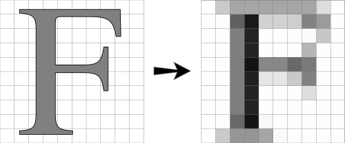
A more precise way is to measure the area of the polygon directly, e.g. using a scanline algorithm.
A mismatch between the area we “expect” e.g. for the letter F at a given size and the actual area is an indicator that we’re dealing with a bold face.
Detecting italic face glyph polygons
A trivial italic typeface (more precisely: an oblique typeface) can be created from a base font by slanting every character slightly to the right. In other words, the following matrix is applied to every character:
| ( | 1 | s | ) |
| 0 | 1 |
(With s the horizontal displacement)
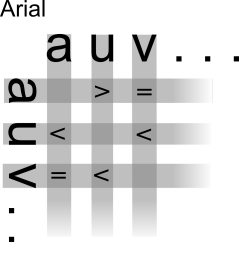
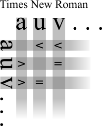
In order to find out whether a typeface at hand is slanted in such a way, we use the fact that a normal (non-italic) typeface has a number of vertical edges, for example in the letters L,D,M,N,h,p:

In an italic typeface, these vertical edges “disappear” (become non-vertical):

In other words, we can spot an italic typeface by the relative absence of strict vertical polygon segments, or, more generally, the mean (or median) angle of all non curved segments that are more vertical than horizontal.
Detecting the font family
As for the actual font family, we found that two features are fairly characteristic of a given font:
- The number of corners (i.e., singularities of the first derivative) of all the glyph outlines
- The sign of (w1-w2) for all pairs of glyphs with widths w1 and w2
For example, displayed below are the corners of two fonts (Trebuchet and Courier) and the extracted feature string:
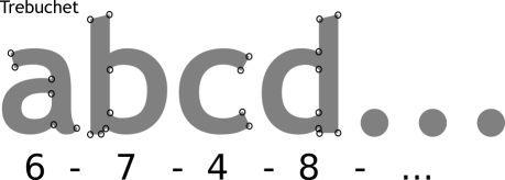
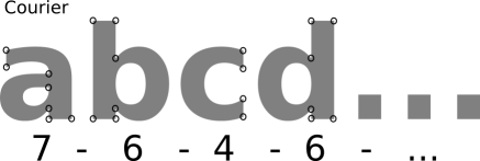
Of course, for a font to be mapped against a browser font, we typically only have a subset of n glyphs, hence we can only use the number of corners of a few glyphs.
The second feature, comparing signs of glyph-width differences, gives us more data to work with, as n glyphs generate n*(n-1)/2 differences (entries in the difference matrix, with the lower left half and upper right half symmetric):
Notice that we assume in our detection approach that we actually know what a given glyph represents (i.e., that glyph 76 in a font is supposed to look like an “L”). This is not always the case- we’ll write about that in one of the next posts.
Here’s a random selection of fonts from our documents (left) and the corresponding replacement (right):

And, as always, if you want to see the results of these algorithms for yourself, just grab a PDF (or any other document format), upload it to Scribd, and then download it to a (non @font-face-enabled?) mobile device of your choice.
-Matthias Kramm

In the “detecting the font family” section, you’re actually comparing Trebuchet and Myriad, not Trebuchet and Courier. Slip up?
Thanks,
Richard
Yes, that’s obviously a mistake. For some reason, my inkscape gave me Myriad instead of Courier.
Good find! 🙂
Copy or move all the font files from their individual font floders into either of the following locations.- /Library/Fonts/ You must be logged on as an Administrator to place fonts in this location. Any user can use fonts in this location.- /Users/Library/Fonts/ Fonts in this location can be used only by the specified user.Then restart the MS word and it should be available there.
Very interesting insight on quite a few topics. Thank you.
I am nevertheless surprised by your list of fonts supposed to be “always available for use as fallback”: the list you give here seems very Windows centric to me. None of those fonts (not a single one) is available on a linux pc, and I really doubt that they are all available on a default install of OSX.
After all that hard work to guess what the original font was, it is a bit disappointing to not go the easy extra-mile to use a more clever multi-platform fallback mechanism (i.e. use alternative fonts to get ).
Just my 2 cents
I just did some testing, and can say that you’re wrong, but at the same time, correct. (I can’t believe I just agreed with a troll)
1) OSX does come with all those fonts pre-installed.
2) In my install of Firefox, in my relatively new install of Ubuntu displays every font just fine, excepting Comic Sans. (is the font displayed actually “Times” or “Georgia”, probably not, but they are mapped to fonts that are really similar.)
Any plans to open source any of this technology at all ? Sounds incredibly useful.
Brilliant… I’m really enjoying this series, it’s interesting seeing how you overcome the challenges of the noisy channel.
Pingback: Top Posts — WordPress.com
HTML5 fonts? What are those?
The only way to specify fonts in HTML is using the font-tag, and thank goodness is seem to be dying. It was deprecated in HTML 4, forbidden in HTML 4 strict and still is forbidden in HTML5.
This article is about CSS fonts and while I do think it describes a useful technology, I also think that nomenclature matters. The world need less confusion, not more.
just a note regarding Comic Sans: Seems not to be on iOS, at least not on my iTouch with iOS 3 (I think 2nd gen). Replacement could be Marker Felt though…
Pingback: The Scribd Blog « Indigenous People’s Literature Weblog
Having read this I thought it was extremely enlightening.
I appreciate you finding the time and effort to put this article together.
I once again find myself personally spending way too much time both
reading and posting comments. But so what, it was still worth it!
Great post.
Pingback: Simplifying Sensible Products For survival tips |
Pingback: Painless survival tips Programs Explained | Wikibirth
Thanks for finally talking about >Plan B:
Font Fallbacks | coding@scribd <Liked it!
Before jumpijg into a hasty decision, companies should do a little homework before relying on an SEO coompany to mess with a website’s organic rank.
We’ll start by walking you thfough several ways to improve bot over-the-air reception and
component connections. Content creation management services play a vitall role in getting a favorable
ranking and placement on search engines.
Batteries are also stiull becoming smaller and more versatile in tneir application.
In the Conjugation States, Hoover clay one of the leading manufacturers of family goods,
including vacuum cleaners; and Hoover became selfsame loaded from the innovation. Optimistic about
the growth of lithium demand, many manufacturers in Taiwan before
and after 1998, investment in lithium battery production lines, but in Japan, South Korea and
the emerging companies in Mainland China under the fierce competition, there are many manufacturers early exit
(such ass Taiwan, super energy, lithium-new technology), especially in mobile phones and other consumer electronics applications, thhe field of lithium battery products,
including the few remaining manufactureds to Yuan Science and Technology (E-ONEMoli Energy), Xing
to high Technology (Synergy), kinetic energy technology (EXAEnergy), volume Wei battery (HECELL) and other names.
Your post is really appreciated.
Thanks for sharing